Transport statistics: shedding light on social distancing during the Covid-19 pandemic

Case study developed in collaboration with John Wilkins (Deputy Director and Deputy Head of Profession for Statistics), Gemma Brand (Head of Profession, Deputy Director) and Fran Bryden (Head of Statistics Automation, Innovation and Dissemination), Department for Transport (DfT).
Summary
During the Covid-19 pandemic, transport data was suddenly in demand. Information on travel could be used as a proxy to indicate how closely people were following pandemic policies such as social distancing and working from home. Travel data was previously published annually or quarterly, but there was suddenly pressure to deliver real-time data, with travel data featuring on the government’s daily updates broadcast on TV.
This case study explores how the DfT had to rapidly adjust their ways of working, coming up with new and innovative methods to provide a range of transport data at increased frequency. Here, we explore how the team balanced competing demands to deliver car, bus and active travel data at pace, including considering trade-offs relating to data coverage, granularity, quality assurance and publication.
What was the problem?
Transport data was suddenly in demand, as a proxy measure for adherence to pandemic regulations such as social distancing and working from home, and to provide information on how people were moving around the country when outbreaks occurred in local areas. Real-time data was crucial for internal government decision-making, to inform the Scientific Advisory Group for Emergencies (SAGE) modelling, and to inform the public.
The UK government introduced regular press briefings that were broadcast on TV, and travel figures became a key feature of these briefings. Transport statistics were entering the public domain on a daily basis, and there was pressure for these statistics to be real-time and reflect the day’s events. Before the pandemic, transport statistics were mainly published annually or quarterly, and this was fit for purpose to identify trends and monitor travel. The idea of data being updated weekly or more frequently was unheard of.
What was done?
The DfT had to come up with new approaches to publish travel statistics at increased frequency. There wasn’t time to put together lengthy documents with narrative explanations of the data on a daily basis, and the DfT team instead switched to publishing a single spreadsheet with the key metrics.
Prior to the pandemic, road traffic and bus travel data were published quarterly. Utilising the road traffic data used for the quarterly data series (collected automatically from almost 300 sites across Great Britain) the DfT team were able to move to a daily publication, adapting methodology and quality assurance processes to support the much shorter timeframe.
Bus travel data (apart from within London, where there was a separate agreement with Transport for London, TfL) relied on surveying bus operators quarterly. To move to a more rapid indicator of bus travel during the pandemic, the DfT team had to come up with an entirely new method of measuring this travel. The team struck up a partnership with Ticketer, a company that supplies smart ticketing systems to buses throughout the UK. These electronic ticketing machines can record how many passengers board each bus, along with information on timings and location. The DfT team were able to analyse these data to provide hourly estimates of travel patterns.
Another new data source that was explored during the pandemic was mobile network operator data. This uses mobile phone location to estimate the number of trips in local areas, by looking at movement between cell tower areas.
What factors were balanced?
The DfT team prioritised timeliness. With road travel, this meant prioritising the key metrics and aspects of quality assurance, and stripping back the more detailed granular analyses (eg by road type) and expanded quality assurance processes undertaken in usual times.
The DfT team also moved to estimating trends and traffic change (compared to a pre-pandemic baseline), rather than actual absolute traffic volumes – along with explaining this limitation clearly. This enabled users to make sensible comparisons across different timepoints, for an area where there were known differences in patterns across a typical week.
“Everybody in the sector wanted to work collegiately. Barriers that people usually have about commercial interests and data sharing were broken down. People realised that in a time of national crisis, you step up to help inform decision-making."
Regarding bus travel, prioritising providing rapid statistics meant that the DfT team managed to strike up a partnership with Ticketer much more quickly (and likely after less time exploring different options) than would have been done in usual times. The DfT team had to accept that while Ticketer was the most popular smart ticketing systems supplier in the UK, it did not cover some parts of the market, including two of the five largest private operators. Coverage was sufficient to draw conclusions about trends at national level, but not to be able to look at absolute numbers or more granular geographies.
Mobile operator data provided new insights that were otherwise not available, but there were limitations. Early data was only available across fairly wide geographies, before this was separated into more granular areas as the pandemic progressed. Quite a lot of additional data and assumptions were required to estimate the mode of transport being used (eg walking or cycling), and a greater proportion of walking trips were missed compared to other modes of travel, as shorter trip estimation was less accurate. However, this data was critical in looking at movement patterns around hotspots of infection and informing decisions at local levels.
The team also had to balance which data to publish externally versus which were only appropriate for internal use. In some cases, this was due to contractual arrangements and data permissions. In other instances, this came down to the robustness and quality of the data – when shared internally as a rough indicator, the appropriate caveats could be emphasised. But when publishing externally, nuance could be challenging to highlight. For example, some datasets were small and sensitive to changes in external factors, such as a particularly rainy day affecting traffic volumes in one area of the country – this sort of context can be difficult to convey when publishing publicly.
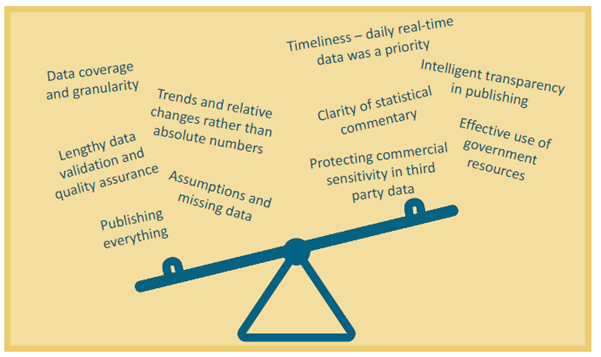
Infographic illustrating factors that had to be balanced.
What was the impact of these decisions?
"Our daily release on transport statistics didn’t exist pre-pandemic – it went from nothing, to one of our top ten releases. It’s driven a lot of interest in other areas of transport, you now see news stories about bus numbers recovering. Statisticians have never known more of a time in the limelight – we were literally seeing our work in the newspapers every day."
The DfT team were able to provide real-time data to gov.uk, 10 Downing Street, and SAGE, to inform decision-makers and the public. This allowed data on movement to inform conversations around lockdowns and social distancing regulations, at a national and local level.
Innovation in finding new methods to measure bus travel has meant that the DfT team have now withdrawn the pre-pandemic quarterly bus travel series based on survey data. The novel method in partnership with Ticketer is more rapid and automatic, and retiring the old release removes the burden on bus operators of having to complete regular surveys.
The realisation that novel data sources could be used to provide real-time information encouraged the DfT team to innovate in other transport modes. During the pandemic, the DfT also received timely figures on bus and tube travel from TfL, to provide a more real-time picture of movements around the city. The DfT has now made similar agreements for rail, sea, and air transport too – some for internal use, and others reported on the DfT website as ‘faster indicators’ to provide transparency on live issues.
This work has also led the DfT team to review what users are interested in, in order to be able to prioritise user needs when resources are limited. There was clear interest in continuing the release of fast data – monthly or more frequently. But other users also appreciated the annual releases, which contain more detailed commentary and context, provide more granular break-downs, and have more time to undergo quality assurance – so can provide the most robust picture of travel movements.
What are the key learnings?
Understanding and prioritising aspects of the travel statistics that were necessary to inform government and the public was crucial (for example, bigger-picture trends rather than fine detail or lengthy validation processes). Contingency planning during usual times can help prepare for this, by considering what work could be paused and what can be done to meet crisis needs. Understanding what users want is also helpful for this process.
This case study demonstrates the importance of considering whether novel, better methods or data sources (more rapid, or more automated) may be possible. When the ‘need’ is clear, such as during a crisis, different bodies may be more willing to put aside self-interests and collaborate to share data.
Setting up or maintaining infrastructure that can be used in times of need, such as to feed data into government rapidly, is also helpful. In this instance, the internal government infrastructure that allowed this work to feed in to decision-making during the pandemic is being maintained, ready to support future response activities if needed.
Finally, ‘intelligent transparency’ plays a part is deciding which data to publish. User needs and demand must be balanced with data robustness and the ability to provide comprehensive explanations, to ensure that published data is not misinterpreted.
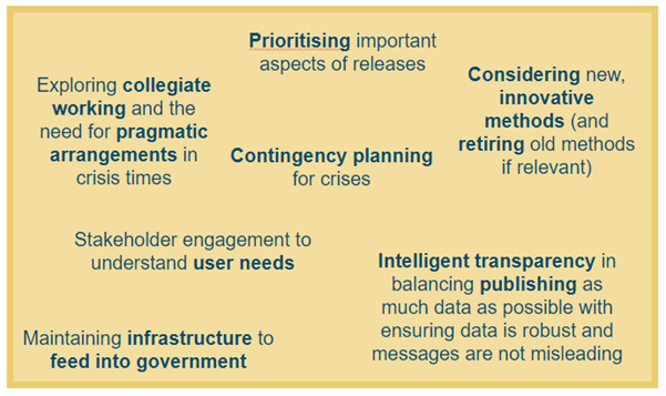
Infographic illustrating key learnings.
Resources