Tracking and transparency: the UK Covid-19 dashboard

Case study developed in collaboration with Clare Griffiths, previously Head of UK Covid-19 dashboard at the UK Health Security Agency, member of RSS Statistics Under Pressure Steering Group, currently Head of Analytical Product Development, Department of Health and Social Care (DHSC) and Julian Flowers, previously Head of Public Health Data Science, Public Health England.
Summary
During the pandemic, the Covid-19 dashboard became a regular feature of our everyday lives. It was the trusted, go-to place for data on cases, deaths, hospitalisations, testing, and vaccination. Its data fed into the daily televised Covid-19 briefings and was regularly broadcast on TV and covered by the major news outlets.
The dashboard was the first example of large-scale public interest in this level of data. But how did all of this come about – how was the dashboard actually set up, and why? What determined which data was included, and how it should be presented? As the pandemic progressed, how were requests to add additional information balanced against the commitment to keep up with the daily updates?
This case study explores how the dashboard was rapidly set up at the beginning of the pandemic to inform government-policy making, and how it was then made public and its data openly accessible. We explore how the dashboard team worked under pressure and scrutiny to prioritise their limited time in maintaining and updating the dashboard to maximise the insights it could provide on the progression of the pandemic.
What was the problem?
At the start of the Covid-19 pandemic, the government needed fast information on how Covid-19 was impacting the country, to inform policies. They needed data on cases, deaths, and hospitalisations. However, this information was dispersed across the health and care system – it was hosted in a range of different locations and in a range of different formats.
"Daily updates meant reimagining the whole system – most public health systems are geared up to annual or quarterly reporting. But we were so proud that the latest data were always available to the public at the same time they were seen in Downing Street."
A team was assembled to pull the data together into one accessible dashboard and update it daily. The team began with just three individuals, reaching a peak of about 18 individuals as the pandemic progressed.
So that the data informing government decisions was transparent (as is best practice), the dashboard was also made available to the public and published online.
Initially, there was pressure to develop the dashboard quickly so that its data could inform imminent decisions such as when to end the first lockdown – a politicised topic. The dashboard was also used to generate data for the daily televised Covid-19 briefings run by the government, adding pressuring in terms of a firm deadline and wide-spread public interest in the figures.
As the pandemic progressed, there was demand for additional data to be added to the dashboard. For example information relating to vaccinations where the vaccines started to be rolled out, and information relating to local areas when local restrictions were implemented. The dashboard team had to prioritise their limited time to balance maintaining the dashboard with adding data that could provide important insights about the progression and impact of the pandemic.
What was done?
The team had to locate data sources to pull into the dashboard, and build a pipeline to process the data. There were challenges with compiling the various sources of data and the volume of the data. At its peak, the dashboard pulled in data from more than 26 sources – from a mix of basic manual and sophisticated automated inputs, including approximately 700 million raw figures.
Extensive user testing was carried out to inform the development of the dashboard – the team engaged with the public and gathered feedback on prototypes to explore how information could best be presented and understood. When the dashboard was published, the team also opened up the data (using Application Programming Interfaces, APIs) and the code underlying the dashboard, so that anyone could access it and carry out their own analyses.
"There was definitely pressure due to the popularity of the dashboard – there was about a three-minute delay between the daily release and news outlets broadcasting it. There was limited time for quality assurance and no room for delays. If we made any mistakes, they would be broadcast to the world."
The team faced pressure from daily deadlines – preparing the data for the daily government briefings at the start of the pandemic, and then for the daily update time of 4pm. While the set daily update time was helpful in order to be transparent and keep the public informed, this was a significant source of pressure for the dashboard team. The team was conscious that the daily processing, quality assurance, checks, and sign-offs had to be ready for a firm deadline – when tens of thousands of people would be tuning in to the news or going online to check the figures.
What factors were balanced?
Time was a key priority throughout the process – from setting up the dashboard, to deciding which data sources to include, to balancing requests for additional data to be added to the dashboard as the pandemic progressed. Time pressure meant that the dashboard was initially developed using existing coding skills within the team, before additional expertise could be recruited and a more sophisticated pipeline put together.
“Ministers and senior officials didn’t always understand how much investment in time and resource was required to spin this up and maintain it, or that things weren’t always possible if we didn’t have the data or a really short time-frame was requested – there was a lot of compromising."
Requests to include additional data on the dashboard had to be balanced with the commitment to maintain the daily data processing and updating of the dashboard. Requests – which came from a variety of sources, including members of the public and across government (eg No.10, Test and Trace, and the Health Minister’s team), had to be prioritised according to the usefulness (value) of the additional data in providing insights to the pandemic, along with the urgency and source of the request.
One example where the value of adding information had to be balanced with other factors was when considering which information to include on Covid-19 testing. The dashboard included information on how many tests were completed. While it might have been possible to also include figures about how many tests were sent out (a government target), this information did not provide significant insight into how the pandemic was progressing, and so was not included on the dashboard.
Another area where factors had to be balanced was in the communication of the data, to ensure it was readily understood – especially by a public audience – and not at risk of misinterpretation. For example, there was debate over whether to use standard linear scales or logarithmic (log) scales (that increase exponentially) to display data that spanned a large range, eg for infection rates where the number of infections was increasing ever-more rapidly over time. While those well-versed in statistics or infectious diseases may have expected this type of data to be presented on log axes, these are often not well understood by the public. A compromise was found by including a ‘toggle’ button to enable users to view the graph with or without a log scale.
Another example where the best way to communicate data had to be carefully considered was in the presentation of data relating to the location of cases – where factors such as detail, interpretability and privacy issues had to be balanced. A map with individual dots for each infected person would have been the most detailed option and could have been readily understood, but was not suitable from a privacy and data protection perspective. Larger areas (such as by local authority) would have missed important local detail. Eventually, a balance was found by using ‘Middle Layer Super Output Area’ (MSOA, areas covering approximately 7,000 people) to display how many cases there were in areas of England. However, the public were not familiar with this term so the decision and definition had to be carefully explained.
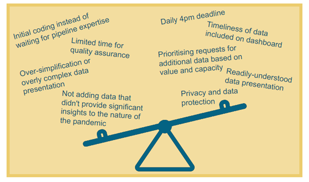
Infographic illustrating factors that had to be balanced.
What was the impact of these decisions?
"When the dashboard first launched, there was much more interest than imagined – with tens of thousands of hits – and the site actually crashed. We’d been focussing so much on how to present the data but realised we needed to beef up the IT infrastructure to cope with this demand. We were conscious that if the system crashed, people might think we were keeping things from them."
The dashboard became a popular and trusted site, with approximately 1.5 million daily users and around 200,000 concurrent users at peak times. The existence of a single trusted source for the range of Covid-19 data helped to increase public understanding about the pandemic and improve trust in government policies, as the data underlying decisions was public. The public also used this information to inform their own decisions, such as how cautious to be in their daily movements.
The dashboard team was small and couldn’t analyse every possible cut of the data. Opening up the data and code meant that anyone could download it and do their own analysis if they wished. Local organisations could perform more detailed regional analyses, and pick-up from other organisations, such as Our World in Data, meant that the data could have even wider reach and impact.
Open data also meant that any errors could be quickly spotted – by the ~100,000 people reviewing the data and code – and rectified. The dashboard team were proud to be transparent, but this also meant being vulnerable to criticism: while many users sought to improve the dashboard, a minority tried to catch mistakes in order to ridicule the dashboard or justify an unfounded theory. Making the data accessible also provided room for misrepresentation, as the data could be plotted and (mis-)presented to prove a point.
This was the first example of the public being interested in data at such a large scale. The dashboard team hopes that the increased profile of public health data during the pandemic inspires further interest in data on issues that impact the public. They would like to see their dashboard model used more widely as a transparent way of sharing data publicly.
What are the key learnings?
The team reflected on the range of skill sets and expertise necessary to build a data system like the dashboard – including data/statistical expertise to understand and present the data; data engineering to build a reliable pipeline; digital expertise to consider user experience and design; and subject-specific (infectious disease) knowledge to provide context and sense-check the data. The team had to recruit over the course of the dashboard set-up and maintenance to cover these skills. They endeavoured to avoid burnout by rotating staff in and out of the team as the pandemic progressed, though this became more difficult when Public Health England was abolished and staff were moved into the new UK Health Security Agency (UKHSA) or DHSC.
The team reflected that contingency planning should include consideration of the necessary expertise, how to access it, and how to ensure sufficient team capacity. It would also be helpful for staff from each area of expertise to have an understanding of what the other professionals need (eg data analysis experts understanding the importance of consistent formatting and data architecture for building pipelines) in order to efficiently work together.
Communication between the dashboard team and the ministers and government officials who were interested in the dashboard data could sometimes be challenging, with the separate teams coming from different perspectives. During the pandemic, a new role was created – Head of Data Analysis in the Secretary of State for Health and Social Care's (Matt Hancock, at the time) Private Office. This role bridged the analytical and policy-making teams, providing in-house data expertise to the Health Secretary and helping to ‘translate’ between the two teams – which the dashboard team found very helpful to improve communication. This also highlights a skills gap – improved understanding of data among ministers and in government policy teams would have been useful to aid discussions and decision-making around the dashboard, as well as around data more broadly.
"The underlying data infrastructure was absolutely critical. Of course people don't see this, they just see the pretty front end, but none of that would have been possible without some heavy duty data infrastructure. Ideally this would be in place beforehand so that it is easy to add new data streams etc quickly when in crisis mode."
Data-sharing and common infrastructure were also of key importance. There is often a culture of protectiveness over data, but had there been some kind of organised health data repository, with agreed standards and common architecture, it would have been easier to set up the dashboard at the beginning of the pandemic. This would have avoided navigating the many different agents in the complex health and care system and spending time reformatting data or error-checking figures that had been entered manually. Increased collaboration would also have been helpful across the UK. The devolved nations collect different data on health, making it challenging to source, combine or compare the statistics.
"One time there was a delay in a part of the data – daily death count. We put a warning banner on the website, but some of the news outlets were automatically getting the data rather than checking our website. They didn’t see the warning, and proceeded to broadcast reports of no deaths! We had thought it would be good to get the rest of the data out even if one aspect was delayed, but we didn’t do that again – the risk for misinterpretation was too high."
The team also reflected on the importance of user research and understanding user perspective. For example, while the dashboard team worked with multiple display screens, user research showed that over half of dashboard users (62%) viewed it on mobile devices, and 89% of visits were for personal rather than professional use. This meant the team knew to focus on improving the user experience on mobile devices and to include content relevant to personal decision-making. User research also emphasised that people did not like delays or big corrections to the numbers (for example, when death counts were revised to include additional data). This meant that the dashboard team could build in comprehensive warning systems and focus on clearly communicating when and why changes were necessary.
"Ultimately, because it was an emergency, solutions were found quickly. But this ebbed away as the emergency faded, making it hard to properly build on lessons learned."
There is a need to ensure that solutions found during the pandemic, such as data-sharing agreements and increased resourcing for data projects (in terms of both capacity and finance) can be sustained. There is a risk that the fading of ‘crisis mode’ could otherwise mean that lessons learnt during the pandemic will not be built on, leaving us less well-prepared than we could be if another crisis arises.
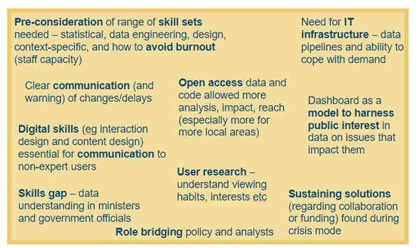
Infographic illustrating key learnings.
Resources
- UKHSA blog: Coronavirus (COVID-19): Using data to track the virus, April 2020
- UKHSA blog: Coronavirus (COVID-19): Real-time tracking of the virus, May 2020
- UKHSA blog: Behind the headlines: Counting COVID-19 deaths, August 2020
- UKHSA blog: The COVID-19 dashboard: bringing together data and statistics in one place, September 2020
- UKHSA blog: The COVID-19 dashboard: a design and feature evolution, October 2020
- UKHSA blog: Lateral flow testing – rapid tests to detect COVID-19, December 2020
- UKHSA blog: Counting deaths during the pandemic, February 2021
- UKHSA blog: Behind the scenes: Expanding the COVID-19 dashboard, March 2021
- RSS and Significance magazine campaign: Statistics are vital: An interview with Clare Griffiths, December 2021
- UKHSA blog: What Does COVID-19 look like in your area? December 2021
- Microsoft blog: UK COVID-19 dashboard built using Postgres and Citus for millions of users, December 2021
- UKHSA blog: Reporting the vital statistics - how data management has been central to the handling of the pandemic, January 2022
- Statistics Authority case study: Voluntary Application: Demonstrating the value of the COVID-19 Dashboard through the Code of Practice for Statistics, February 2022
- UKHSA blog: Changing the COVID-19 Case Definition, February 2022
- UKHSA blog: The COVID-19 Dashboard Moves to Weekly Updates, June 2022
- Civil Service World: Dashboard Confessional: Civil Service World interview with Clare Griffiths, September 2022
- UKHSA blog: Changes to the COVID-19 dashboard and COVID-19 vaccination surveillance report, November 2022