The History of Statistics & Young Statisticians sections ran a data visualisation challenge 4-19 June 2021 aimed at celebrating the pioneering work of American author Mary Eleanor Spear (1897 –1986).
Mary Eleanor Spear is credited for popularising the 'range-bar' decades before John Tukey called it the 'boxplot' and she had a long career as a government 'visual information specialist' in the department of Labour statistics of the American federal government, before writing two major textbooks on data visualisation: Charting Statistics (1952) and Practical Charting Techniques (1969). She aimed her very detailed tips both at practitioners and the general public, ranging from presenting data in graphic form on television to ensuring accessibility and readability.
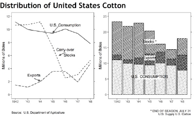
The challenge invited the statistical community to share their versions of Spear’s plots on the Distribution of United States Cotton between 1942 and 1948, including data on consumption, stocks and exports, and published in her book Charting Statistics from 1952.
Here's the original version:
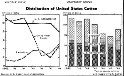
Spear's charts of the distribution of US cotton. Source: Charting Statistics, archive.org
Participants were welcome to use any software and media, and entries include a hand-sewn recreation of the charts. The challenge also encouraged Twitter discussions on usage of software packages, fonts, and issues of accessibility, and participants kindly made their code available. There were 14 entries in total.
The winners
The prize for the Most accurate #CottonViz entry went to Matt Dray for a careful recreation of Spear’s plots in base #rstats. Matt has kindly made available his code and a blog post on the process.
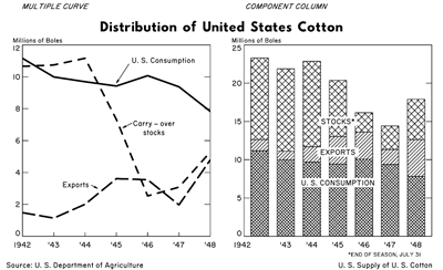
Most accurate #CottonViz by Matt Dray.
The prize for the Most creative #CottonViz entry went to Liz Bravo for a beautiful and detailed hand-sewn recreation of Spear’s plots.
Most creative #CottonViz by Liz Bravo.
The prize for the Most innovative #CottonViz entry went to Dennis Kao for his cotton-plant plot in Tableau, including an interactive version.
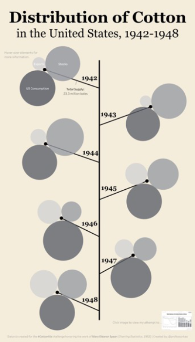
Most innovative #CottonViz by Dennis Kao.
The judges also gave a special mention to Nicola Rennie for her R waffle plot with hand-drawn bales which also scored highly, and thanked all participants for all their great plots.
Entries were judged by #FloViz winners Sian Bladon & Edward Gunning, by members of the YSS committee Daniela Cuba (University of Glasgow), Jack Kennedy (University of Newcastle), Jake Emmerson (University of Leeds), Naseerah Akooji (University of Lancaster) & Maria Dunbar, and members of the History of Statistics Section Cecilia Lanata-Briones (University of Warwick) & Altea Lorenzo-Arribas (Biomathematics and Statistics Scotland, BioSS).
Other entries
In Spear’s own words, 'there is quite a difference between simply looking at a chart and seeing it', so the organisers invite you to appreciate the other fantastic entries received.
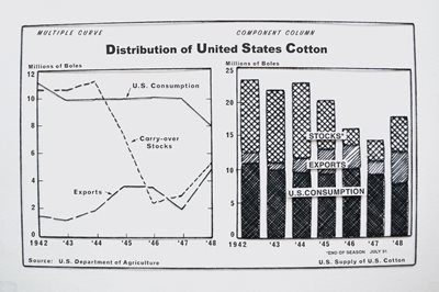
Colin McNicholl submitted a very close version of the original plots (see below).
Submission emailed by Colin McNicholl.
Several entries attempted to recreate the plots using different means. Nicola Rennie and Kaylea Haynes attempted the plots using R library ggplot, and even ventured alternative coloured versions. Abi Broad attempted the stacked bar plot used Python.
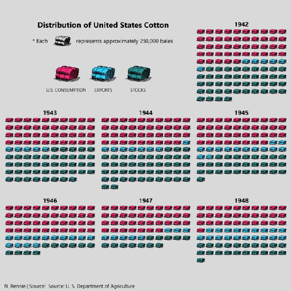
Waffle plots using R ggplot featuring hand-drawn cotton bales by Nicola Rennie.
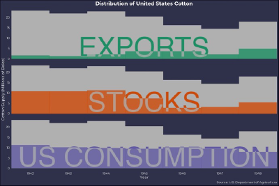
Coloured stacked barplots by Kaylea Haynes using R ggplot.
Rank plot using Microsoft Power BI by Abi Broad.