Following the success of the
#FloViz challenge last year to celebrate the bicentenary of the birth of Florence Nightingale on 12 May, we invite you to take part in our 2021 data visualisation competition: #CottonViz in honour of
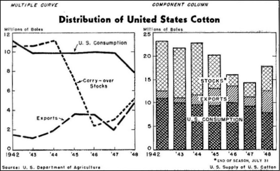
Mary Eleanor Spear and her plots of the supply of United States cotton in the 1940s.

Spear’s charts of the distribution of United States cotton. Source: Charting Statistics, archive.org.
Mary Eleanor Spear (1897-1986) is credited for introducing the 'range-bar' decades before John Tukey called it the 'boxplot' and she had a long career as a government 'visual information specialist' in the United States before writing two major textbooks on data visualisation: Charting Statistics (1952) and Practical Charting Techniques (1969). In her first book, she even included tips about presenting data in graphic form on television and encouraged both readers and visualisation experts to properly think of the different aspects of a chart. In her own words, 'there is quite a difference between simply looking at a chart and seeing it'.
We challenge you to create a fun, interesting, and creative way to present the same data.
We welcome entries using any software or media from both adults and children.
You can download the data here.
The data corresponds to yearly US supply of cotton from 1942 to 1948, including US consumption, exports, stocks and total supply.
What to submit
Spear presented the stocks, exports and consumption data all on one graph. You can aim to recreate the same graphics as Spear or create something unique!
We recommend for children to just focus on one aspect of the data set but would be delighted to see entries based on the full data set too.
How to enter
You can send your entries to our email statsyss@gmail.com or tweet us @statsyss or @HistoryofStats using the hashtag #CottonViz
Please note that we will share the entries on social media and our website.
Closing date
Deadline for submissions is midnight (GMT+1), 19 June 2021.